The New Era of Money: Everything to Know About Our Updated Look and Features

In 1972, Money launched as the first magazine solely dedicated to personal finance. The thought was simple: If you could learn to save and invest, your life will be that much richer.
Now nearly 50 years later, Money is still committed to that original mission, just in a purely digital space. Today, we’re excited to share the next evolution of the brand’s history with a comprehensive overhaul across all platforms, the first in 20 years. Readers will now get a much more streamlined experience with Money.com and the high-quality information they’re looking for.
Striving for Elegance and Authority
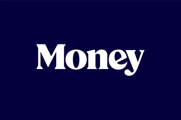
To achieve Money’s new look, we tapped international design experts to help design the logo, with the idea of paying homage to the brand’s original design that hit newsstands. We wanted to optimize the logo for today’s digital world, so we chose a design that would look gorgeous on any device, no matter what the screen size. The uppercase “M” of Money showcases confidence through its perpendicular stems and sharp angles of the strokes as if it was in a straight posture. From there, the serifs carry a regalness to it, hinting at the authoritative principle we wish to encapsulate.
This aesthetic design choice was also implemented into the article page layout, where readers are greeted with magazine-style drop caps at the beginning of each article, and a clutter-free column that delivers the information people want, without distraction.
As readers experience their favorite articles, noticeable are small details that we’ve woven throughout the site. Some are quite apparent, like the use of coins; some are more subtle, like the running security lines present on actual dollar bills. We call these Money’s “waves of wealth,” which are inspired by the language of bank notes and natural energy curves. They’re designed to make readers feel at ease with the ebbs and flows of their financial journey.
Money Now and in the Future
Money’s new look and feel is the latest of strategic investments into the brand that position us for the next 50 years. In addition to delivering up-to-date news daily, we’ve expanded our resources to include a number of new tools and guides every month that help everyone make smart, educated decisions. A few highlights over the last year include:
- Money’s Mortgage Calculator and up-to-date mortgage rates
- A comprehensive look at insurance buying, from life insurance, car insurance, and pet insurance
- In-depth Money 101 guides that tell readers the basics, from how to get a personal loan, to what is a 401(k), how to use Robinhood, and much more.
We love our readers and hope you’ll find the new look and feel of Money a welcome change in your mission to live a richer life. And if you have any questions or feedback, please drop us a line.
Mike Ayers
Executive Editor
editor@money.com
—

